A gallery wall is one of the most personal and stylish ways to decorate your home. When done well, it appears curated and intentional; however, without a plan, it can quickly turn into visual clutter.
With a few layout strategies, you can design a gallery wall that feels cohesive, polished, and distinctly your own.
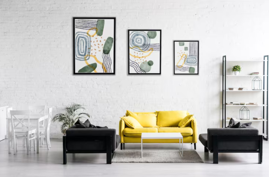
The Grid Layout
If you love order and clean lines, the grid is your best friend. This layout arranges frames in neat rows and columns, all evenly spaced. Matching frames in the same size gives a uniform look, while a mix of photos or prints keeps the display interesting. The grid works exceptionally well in modern or minimalist homes where symmetry enhances the space.
For another creative way to refresh your home, see Choosing Statement Lighting for Every Room.
The Salon Style
Inspired by traditional European galleries, this layout embraces abundance. Frames of different sizes and styles are clustered together from floor to ceiling, creating a rich and layered effect. The key is to maintain balance by spacing items evenly and repeating frame colors or finishes. Salon walls shine in eclectic or traditional homes where personality takes center stage.
The Linear Arrangement
Perfect for hallways or above furniture, a linear arrangement places frames along a single horizontal line. This could be at eye level or aligned with the top of a sofa or console table. The consistent line anchors the artwork, giving a clean and sophisticated feel even when frame styles or art vary.
Explore Designing an Outdoor Living Room That Feels Like Indoors for comfort and style inspiration.
The Centered Cluster
For a cozy and approachable look, try a centered cluster. Start with one central piece, such as a large print or photo, and build smaller frames around it. This arrangement works well on smaller walls or in nooks, making the collection feel purposeful without overwhelming the space.
Mix and Match with Intention
Combining different frame styles and art types can create a stylish look when done thoughtfully. Stick to a limited color palette for frames, or repeat a single material, such as wood or metal, to tie everything together. Mixing photography, paintings, and prints adds interest while maintaining a cohesive feel.
Don’t Forget Negative Space
A polished gallery wall isn’t about filling every inch of wall space. Leaving room around and between frames gives the eye a place to rest. Negative space makes the collection look intentional rather than chaotic, and it ensures the wall enhances the room rather than overtaking it.
Play with Shapes and Sizes
Varying frame sizes adds rhythm to a gallery wall, while introducing different shapes, such as round or oval frames, which can break up the monotony. Mixing sizes and shapes strategically creates visual movement and adds personality without sacrificing polish.
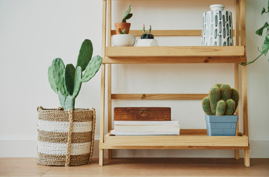
Incorporate 3D Elements
A gallery wall doesn’t have to be limited to flat art. Adding a sculptural object, a decorative plate, or even a small shelf with a plant can bring depth. These elements add dimension, making your wall feel more dynamic and unique.
To keep your décor evolving year-round, see Easy DIY Frame TV Art for Every Season.
The Final Touches
Regardless of which layout you choose, preparation is crucial. Lay out your gallery on the floor before hanging to test spacing and balance. Use painter’s tape on the wall to visualize placement before committing to nails. With a thoughtful plan, your gallery wall will feel curated, balanced, and timeless.