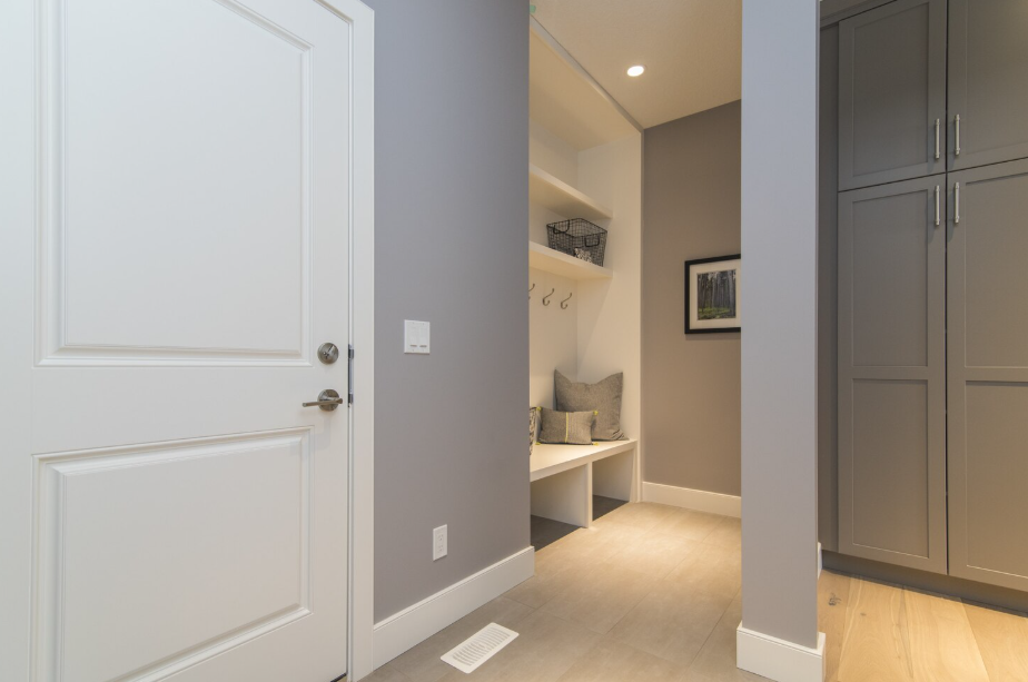
Hallways are often the most overlooked spaces in a home. Without natural light, they can feel narrow, dim, and unwelcoming. A fresh coat of paint is one of the easiest ways to transform a hallway into a lighter, more inviting space. Choosing the right shades makes all the difference.
Crisp Whites for an Airy Look
White paint is the go-to choice for instantly brightening any dark area. Opt for crisp, clean shades like true white or slightly cool-toned whites that bounce light around the space. Warmer off-whites work well if you want a softer, cozier vibe. Pairing white walls with pale trim adds depth while keeping the hallway airy and inviting. This white paint color guide offers timeless options that work well in darker spaces.
Soft Neutrals That Add Warmth
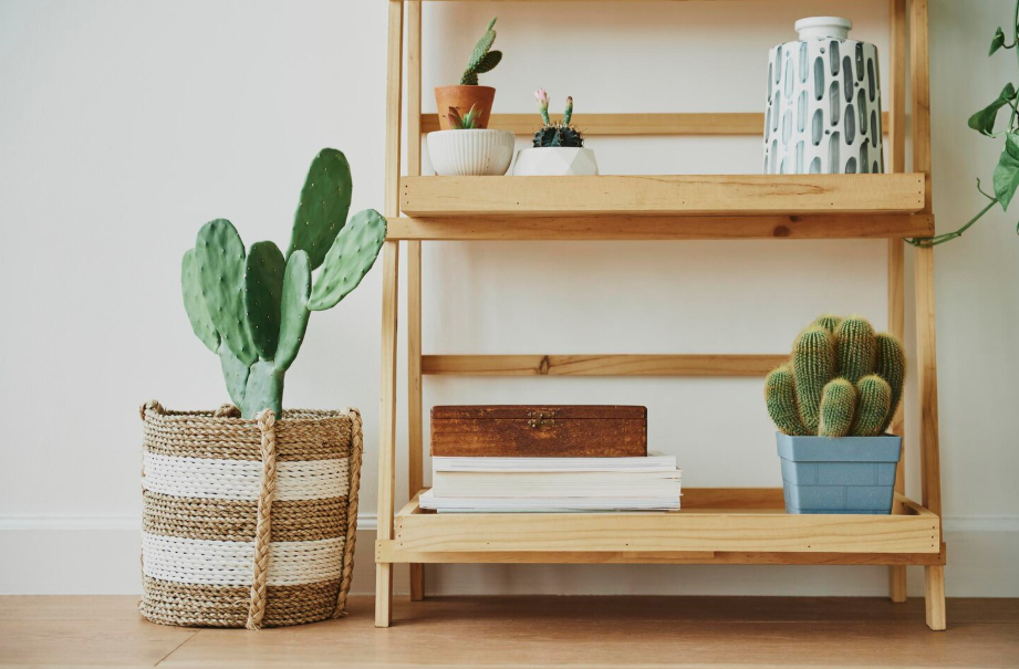
Beige, taupe, and greige tones are excellent for hallways that need warmth without feeling heavy. These colors bring subtle depth while still reflecting light effectively. Neutrals also serve as a versatile backdrop, making it easy to showcase artwork, mirrors, or decorative accents in the hallway.
See Make Your Own Signature Home Scent to complement and shape the atmosphere.
Pale Blues and Greens for Calm Energy
Soft pastel blues and muted greens add a refreshing, tranquil feeling. These colors evoke a sense of nature and can make even a windowless hallway feel connected to the outdoors. A pale blue-gray, for example, creates the illusion of more space while maintaining a sophisticated palette.
Light Grays for Modern Elegance
For a contemporary look, light gray is a wise choice. Stick to silvery or cool undertones that reflect light rather than absorb it. Light gray works beautifully with both crisp white trim and darker accent doors, making the hallway feel modern and expansive.
For more on pairing colors and textures, check out our guide on Mixing Vintage and Modern: A Beginner’s Guide.
Pastels for Subtle Personality
If you prefer a hint of color without overwhelming the space, pastels like lavender, blush, or buttery yellow are perfect. They brighten hallways while adding just the right amount of character to keep things interesting. Pastels can also tie into adjoining rooms, creating a seamless design flow.
Creams for a Softer Alternative to White
If bright white feels too stark, creamy shades are a beautiful compromise. They still reflect light but add warmth that feels welcoming rather than clinical. Creams pair exceptionally well with wooden floors or stair rails, blending traditional charm with a brightening effect.
Two-Tone Walls for Added Dimension
Painting the lower half of your walls in a slightly darker shade and the upper half in a lighter hue adds depth without darkening the space. This approach makes narrow hallways feel taller and more dynamic. Pairing a soft gray base with a pale blue top, for example, creates visual interest while maintaining brightness.
Coordinating Doors and Trim
Don’t overlook doors and trim when brightening a hallway. Painting them in a lighter shade than the walls enhances contrast and crispness. Alternatively, painting them the same shade as the walls creates a seamless, elongated look that helps the space feel larger and less cluttered.
For more styling upgrades that transform overlooked spaces, read The Beginner’s Guide to Cutting Gardens.
Finishing Touches to Amplify Light
No matter which paint color you choose, finishes and styling make a significant impact. Semi-gloss or satin paints reflect more light than matte finishes, subtly boosting brightness. Adding mirrors, light fixtures, or metallic accents enhances the effect and ensures your chosen shade reaches its full potential.